NewSkin

Note: the project has been moved from here to NewSkinProject so that this page can be used to collect observations, errors, and ideas.
Contents
- 1 Hello Team!
- 2 On taking notes
- 3 All Browser Platforms
- 4 Things to test in your browser
- 5 First Review
- 6 Simon's Notes
- 7 Joey's Notes
- 8 MB's Review
- 9 Ward's Observations
- 10 Bigger Tabs
- 11 Evenplayn's Review
- 12 Michael's Experience
- 13 Personal area
- 14 RecentChanges
- 15 edit / save
- 16 The Logo from the Consensus Poll
- 17 Visited links
- 18 Plain Links
- 19 Old Skin still reappearing
Hello Team!
So this page will be the base for all your notes, concerns, comments, problems, gripes, screenshots, errors and other ramblings about the "beta" skin.
On taking notes
If and when you find an error or something that doesn't "seem right," please note the following information:
- What happened? Which page on AboutUs did you notice this on?
- What is your Operating System (e.g., Windows, Windows XP, Windows 98, Mac OSX, Linux, ...)?
- What browser are you using (e.g., Internet Explorer 6.0, Internet Explorer 7.0, FireFox, Safari, ...)?
- Are you logged in to AboutUs?
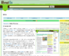
- Which area of the page did it happen in? Below is a screenshot from Firefox with some area names labeled to make this easier to report.

All Browser Platforms
- When i click "move", the rest of the toolbar disappears.
- This is how Monobook works, and is standard MediaWiki functionality. This may change if desired.
- Google maps extension doesn't render under OS X/Firefox & Safari see User:John Stanton
- It doesn't render at all! yikes!
- Because of the locations of the "flag" button and the "useful links" menu, I find that I often overshoot the flag with my pointer and the useful links drops down, covering up the flag. Is there any way one or both of these could be moved so this doesn't happen? TedErnst | User talk:TedErnst 13:35, 5 September 2007 (PDT)
- In my personal tools area my name is really small and brown and "My Talk" is large but also brown. I think both are supposed to be large and orange. Also the little blank person icon doesn't show up next to my name. Mozilla/5.0 (Macintosh; U; Intel Mac OS X; en-US; rv:1.8.1.6) Gecko/20070725 Firefox/2.0.0.6
- I think this is an overall problem with the skin and OpenID logins. --Vinh Nguyen
-
Google searching doesn't work. - My username is in all lower case. Nathan (talk) 17:44, 5 September 2007 (PDT)
- Mine too. Must be by design. I'm not sure I like it.
- Flag is not working... Isabel 15:46, 10 September 2007 (PDT)
IE6 on Windows
- Please refer to my notes below regarding problems between the newskin and portal formats.--DaughertyBw 19:07, 6 September 2007 (PDT)
IE7 on Windows
- The grass does not appear at the top. Above the grass is a pale green horizontal bar. In this pale green bar appears the AboutUs text part of the logo (above the edit button). Also, the "useful links" menu doesn't seem to appear at all. TedErnst 06:43, 8 September 2007 (PDT)
- Actully, since I couldn't upload the screenshot because of the missing menu, I switched back to the old skin and don't see an option to choose the new skin at all. Interestig. TedErnst 06:48, 8 September 2007 (PDT)

Netscape on Windows
-
When pages are resized and browser windows are adjusted, the content footer doesn't render as nicely as it should. The two divs don't evenly fill out the entire space.
Firefox on Windows
 Fonts are not smooth making all text unreadable, except bold and courier texts.
 There is a really strange scrollbar (sometimes) between the sidebar and the main section of the page. TedErnst | talk 09:12, 11 September 2007 (PDT (seen screenshot)

Safari on Windows
-
Safari has one slight problem rendering the content footer with enough padding. This isn't detrimental, purely visual. -
The content action icons show an what looks to be an extra pixel of info.
FireFox on OSX
-
The something seems to be messing the "section edit" links up on some pages. See RockProperties.com, Loofie.com and CompraWifi.com for an example. All the links for the section edits are stacked at the bottom of the page. It's possible maybe that somehow the missing logo is causing this (seems like the common thread with all these pages), but it's an issue for sure.- This looks like it may be a problem with the DomainBox CSS. From what I can tell so far, if you float an image left, and probably anything else, the links go awry. Floating right or center do not, however, cause any problems.
- I've handled the above section by moving the edit links. Floats were disturbing their peace.
-
Firebug reports error "document.searchbarform.auSearch has no properties" on any pageload. Mac OS X 10.4.10 (8R2218) Darwin 8.10.1 Safari Version 2.0.4 (419.3) - On my watchlist, the bold is a bit subtle. It's not easy to tell which pages I've already viewed and which I haven't. TedErnst | talk 23:17, 5 September 2007 (PDT)
- When I put "JoyOfMovement.com" in the search bar, I get a blank page and this url: http://www.aboutus.org/index.php?title=Special%3AAboutUsSearch2&searchfield=joyofmovement.com TedErnst | talk 18:00, 6 September 2007 (PDT)
- The article tab looks as if it is selected (no brown line underneath) even when a different tab (like history) is actually selected. Mac OS X 10.4.10 (8R2218) Darwin 8.10.1 Safari Version 2.0.4 (419.3)
- Really long lists like http://www.aboutus.org/Special:Allmessages are cut off on Firefox, Camino, and other Mozilla based browsers under the new skin. They are fine in IE, Safari, and on mozilla based browsers with the old skin selected.
Safari on OSX
- In my personal tools area my name is really small and brown and "My Talk" is large but also brown. I think both are supposed to be large and orange. Also the little blank person icon doesn't show up next to my name. Mac OS X 10.4.10 (8R2218) Darwin 8.10.1 Safari Version 2.0.4 (419.3)
-
"useful links" in PageActionsArea shows up immediately after "move" on the left rather than next to my personal tools on the right. Mac OS X 10.4.10 (8R2218) Darwin 8.10.1 Safari Version 2.0.4 (419.3)
Safari on the iPhone
Things to test in your browser
- Search functionality (with Google search)
- Adult Category flagging
- Pages with Google maps (try User:John Stanton)
- Your talk page, user contributions, watchlist, and preferences
- Various other special pages
First Review
Ok so I have changed preferences to the new skin and these are some of the things I found:
- The graphics are incredible! I like the way the Edit button is easy to see as well as the color scheme!
- Every feature seemed to work properly and correctly,
- I especially like the "animated" graphics such as the closing eye with "watch"
- I didnt like how it reformatted the Portal Pages. this may be a problem if users are able to switch between them in the future.
- On my personal page It cuts off the right side a little making it difficult to see the menu.
I think it definately livens up the pages and seems more user friendly. Especially as mentioned before the "edit" feature. Thanks for allowing me to include my input and I will look forward to the development teams continuing progress.! Bryan Daugherty
what i am seeing
Regarding the portal type pages..
- with the default skin
- with the newskin


- I am using MIE version 6.0 as a web browser
Simon's Notes
I like everything, and haven't seen any problems yet. Two things I would like changed for my own personal preference.
- Move the edit links on pages back to where they were on the right side of the page.
- The grass, atleast part of it in the top left, if it could be clickable to go to the homepage. I'm so use to to clicking there.
- The usefull links is too hard to use, I liked it better when it was part of left nav (now right nav) --Simon | talk 18:40, 5 September 2007 (PDT)
Joey's Notes
- I agree with Simon about the useful links being hard to use. It's not so bad with a mouse, but I've hit the wrong link several times when using the touch pad on my laptop.
- The links in the footer are a little hard to see because they blend in with the background a bit. Could they be changed to a color that doesn't blend in so much? --Joey 19:24, 5 September 2007 (PDT)
MB's Review
I have played with it and tested it for flags and seems to be no problems. I am not fussy about the "useful Links". If I am not so new to the internet, I would not know where a lot of links I want like Home are. It is so small and seems so unimportant. I agree with Simon about these links. Better on the Right Nav--Master Baitor 18:39, 5 September 2007 (PDT)
Another annoying thing is where the useful links are. If you go to flag a site and you put the mouse a little to high as you move, the drop down happens. --Master Baitor 21:29, 5 September 2007 (PDT)
Ward's Observations

I like the new look a lot, and especially the colors. Here are some observations of things that can probably be improved.
- Image and skin overlap in unexpected way when viewing the image page for uploaded image. See thumb. Page in question is here.
- Can we fit the Ads into the skin's color scheme? They need to look like they belong. If their color scheme is shared between old and new, I'd rather see the new look good at the expense of the old.
Bigger Tabs
I like the colors and the placement of the user box on the right. (not sure what your calling it?) I find myself hunting for the tabs- article, history- granted I have a rather small screen. I am not use to useful links and in general would appreciate the font being a wee larger. Initial thoughts as I am not use to it, but these are the things that stand out. Seems to work well in Camino Kasey 14:19, 6 September 2007 (PDT)
Evenplayn's Review
So far, I love the look and feel. However, I have to things to mention
- Move the AboutUs logo and user info box to the left corner. I thought everyone knew that the upper left corner is where the eye naturally goes.
- I had to switch out of the new skin to leave this comment...couldn't figure out how to edit the page or discuss it. Am I missing something? If I can't figure it out, a new user wont be able to.
Otherwise it is great! --Evenplayn 21:08, 6 September 2007 (PDT)
Michael's Experience
I love the new look. When I clicked Preferences -> Skin, I only saw the "default" aboutus skin as an option. To get the new skin I had to manipulate the page DOM and change the radio button value to "design". I'm using Mac OS X with Firefox 2.0.0.6. --Michael 12:03, 8 September 2007 (PDT)
- Same with Safari - no "design" option for skin. --Michael 12:05, 8 September 2007 (PDT)
Personal area
My name is not correct in this new skin, also My talk is prominent, even though I am on my preferences. I think it would be better if we indented under my name, like so:
MarkDilley
- talk
- preferences
- watchlist
- contributions
log out
I like the little logos, but would like them to be consistent. person, talk cloud, watch eye, something for preferences and contributions...

~~ MarkDilley
RecentChanges
I am quite concerned that RecentChanges are buried in the useful links section. I would like that to be in the main skin. ~~ MarkDilley
edit / save
I love the edit stake on the upper left. During the edit process, I think having it as a save button would make more sense. Possibly also having the edit summary up there as well and move don't atomatically protect email addresses on the same line as minor edit and watch this page. ~~ MarkDilley
The Logo from the Consensus Poll
I like the logo that we all worked so hard on from the consensus poll over at AboutUsLogo. I would like it to be represented on the site. If I am mistaken and the consensus poll was about logo elements, please let me know. ~~ MarkDilley
Visited links
My visited links are no longer a different color. Making it difficult to navigate through RecentChanges and my watchlist. Does this have to do with the new skin? MarkDilley
Plain Links
Doing a <span class="plainlinks"> doesn't make the links look like internal links (like it used to). The "plainlinks" class is something we've used a lot to point to things without the links looking like external links (under the new skin, they're dotted links). Generally it's used when we need to have an external link that still goes to the wiki for special actions. Ie. leave a note (this is in Firefox on a Mac) -- TakKendrick
Old Skin still reappearing
Hey guys,
Love the new skin, but after logging in I am redirected to the old skin, and it's stuck now :(
Just thought you guys might like to know.
Miccas 00:04, 12 September 2007 (PDT)